Five Wounds is something of a contemporary classic: a manuscript crossed with Kit Williams’ playful imagination, informed by the language of graphic novels. Although very much a book, in the tactile sense, it has half an eye on what a book might be in a digital era. Jonathan Walker, the author of Five Wounds shares the secrets of the design process and how his text weaves around Dan Hallett’s illustrations
Imagine that the appearance of a book is part of the story it tells, as if it was an artefact created by the imaginary civilisation it describes. Book design becomes an aspect of what the science-fiction community calls ‘world-building’, and as such it applies the principle of ‘Show, don’t tell’ to the surface of the page itself. My fantasy novel Five Wounds uses design in exactly this way. What, then, does the page design in Five Wounds show us?
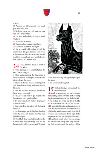
The first thing you might notice is that the text is divided internally into books, chapter and verses, as if it reaches us only via the hands of priestly interpreters. It is also surrounded by several different kinds of image, in several different visual idioms: miniature heraldic coats-of-arms, woodcut- and etching-style illustrations, and, more disturbingly, neurotic doodles, including handwritten scribbles and corrections added on top of the typeset text, as if it has been defaced by an editor who is not no longer certain of its canonical status. Perhaps this is the same reader who has coloured all the coats-of-arms in an enthusiastic but incompetent manner. Below is a sample page from Five Wounds, which shows some of these features.
Five Wounds describes the intertwined fates of five freakish protagonists: Gabriella is a crippled angel; Cur is the rabid leader of a sect of dogs; Cuckoo is a gambler with a wax face; Magpie is a myopic thief in search of the perfect photographic subject; Crow is a leper trying to distil the essence of death as an antidote against dying. Their stories constitute a kind of alternate history of Venice, although we don’t know where we are in time; or rather, we seem to be in several different historical periods simultaneously.
Wherever we are, the Bible is still the exemplary book, but the boundary between sacred text and perverse marginalia has become unclear. Five Wounds looks like Holy Scripture, but the events it describes are more like those of a fairy tale. Indeed, ‘world-building’ is perhaps a misleading term in this context, since the novel’s setting, like that of a fairy tale, seems both distorted and imprecise: more like an image in a fairground mirror than a realistic portrait. In any case, the book’s design helps to describes this grotesque imaginary landscape.
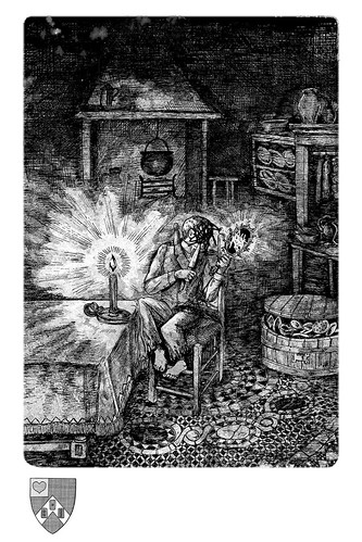
Following a single motif through its various manifestations in the text, the illustrations and the design may help to explain how this works. One of my five protagonists is Cuckoo: a gambler whose wax face can be reshaped at will. Cuckoo’s dilemma – Who am I if I have no face of my own? – drives several incidents in the plot, but it is also dramatised in the illustrations, in which Cuckoo’s face is always scratched out. He is literally defaced, as in the illustration above. His scratched-out face also links Cuckoo by analogy to the scribbled corrections on the typeset text. Like the blacked-out text, his face is ‘under erasure’, and the revelation of his true self is continually deferred.
Cuckoo is obsessed with his reflection, precisely because he cannot identify with this unrecognisable double of himself. The text that accompanies the portrait above comments on this motif:
- AS Cuckoo angled his mirror, the candle flame flared off the blade, obliterating his reflection.
- He imagined the glass as a recording device, which would retain only the movements of the knife’s point and edge across his face, reducing his efforts to a simple pattern of lines.
- What was his face now but the summation of these tiny, accumulated motions?
In fact, I added this passage only after seeing Dan’s image. Thus the interaction between the various elements works both ways in Five Wounds. The images are a commentary on the text; but the text is also a commentary on the images. As the artist R.B. Kitaj put it, ‘Some books have pictures and some pictures have books.’
The broader point here is that key ideas should be present throughout the DNA of Five Wounds, and as such, they should be manifest in every aspect of its production. My job as art director was to ensure that these ideas circulated freely between the text, the illustrations and the design.
Perhaps this all sounds rather abstract, but in every case an emotional question precedes and generates the formal questions. In the case of Cuckoo, the original question was, ‘What does it feel like to have no face of your own: to be alienated irrevocably from your own body and your own emotions?’ The design of Five Wounds doesn’t just help to describe the world in which the story takes place. It also shows what it feels like to be Cuckoo.
Further Resources:


